

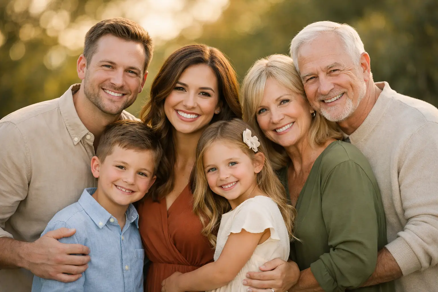
A family portrait can happen in just a few minutes, but the image may hang in your home for decades. That is why choosing the best family portrait color combinations is less about matching everyone perfectly and more about creating a polished, comfortable look that still feels like your real family. The right palette keeps attention on the smiles, hugs, personalities, and little in-between moments you will want to remember.
For families planning portraits in New Jersey, New York, or Pennsylvania, color also needs to work with the season and setting. A beach, a tree-lined park, an urban street, and a cozy home session all have their own natural color story. Thoughtful wardrobe choices help your photographs feel timeless without making anyone feel overdressed or unlike themselves.
What Makes a Family Portrait Color Palette Work?
The most successful family portraits usually use a coordinated palette rather than identical outfits. Instead of putting every person in the same white shirt and jeans, begin with two or three main colors and add a few softer supporting shades. This gives each family member some individuality while keeping the group visually connected.
Think in terms of color families. Warm neutrals such as cream, camel, taupe, and soft brown feel inviting and photograph beautifully in almost any location. Cool neutrals such as soft gray, denim, slate blue, and muted green create a calm, classic look. Then add one or two accent colors that complement the season, such as dusty rose, rust, burgundy, or deep navy.
The goal is harmony, not uniformity. If one person wears a bold pattern, another family member can pull one subtle color from that pattern in a solid shirt, dress, or accessory. This approach looks intentional in photographs while avoiding the overly coordinated appearance that can date a portrait quickly.
Start With One Outfit You Love
The easiest way to plan is to choose one outfit first, often Mom’s dress, a child’s special outfit, or a piece someone already feels confident wearing. Use its colors as the foundation for everyone else. If a floral dress includes cream, sage, muted blue, and blush, those colors can guide the rest of the family wardrobe.
This is especially helpful for maternity portraits, milestone sessions, and multigenerational family photos. There are more people to coordinate, so a single visual starting point prevents the planning process from becoming stressful.
Best Family Portrait Color Combinations by Season
Seasonal color choices do more than look attractive. They help the family stand out from the background without clashing with it. The ideal palette depends on whether you want your surroundings to feel like part of the story or simply a soft backdrop.
Spring: Soft Neutrals, Sage, and Blush
Spring portraits are full of light, fresh greenery, blooming trees, and softer skies. Cream, ivory, light denim, sage green, dusty blue, and blush pink are beautiful choices. These shades work naturally against flowering gardens and park settings while keeping the overall mood light and joyful.
Avoid putting everyone in bright white, particularly in direct sunlight. White can photograph very brightly and may lose detail. Cream or ivory usually provides a warmer, more flattering result.
Summer: Coastal Blue, Sand, and Soft Coral
For beach sessions or sunny outdoor portraits, choose colors that complement rather than compete with the brightness of the day. Soft blue, chambray, sand, beige, cream, pale olive, and gentle coral make a relaxed, classic summer palette. These colors work well from the Jersey Shore to a backyard celebration.
Very bright neon colors can reflect onto skin and become distracting in photos. The exception is a small accent, such as a child’s hair bow or a subtle accessory, when it is balanced by quieter colors elsewhere.
Fall: Rust, Mustard, Navy, and Cream
Fall family portraits are popular for a reason. The rich leaves and golden light create an inviting setting for portraits that feel warm and nostalgic. Rust, cinnamon, burgundy, mustard, forest green, navy, cream, and warm brown are dependable choices.
There is one trade-off: if your location has intense orange or red foliage, dressing every person in rust or burgundy can make the group blend into the background. Include cream, denim, navy, or soft tan to create contrast and keep faces as the focus.
Winter: Jewel Tones and Elegant Neutrals
Winter photographs can be especially striking with deeper, more polished colors. Consider emerald, deep teal, burgundy, plum, navy, charcoal, camel, and cream. These combinations feel festive without requiring everyone to wear holiday-themed clothing.
For an indoor session, fabrics can add warmth as well. Knit textures, velvet accents, wool coats, and layered pieces photograph beautifully, particularly when the colors stay within a restrained palette.
Choose Colors for Your Portrait Location
A location should influence your wardrobe decisions, but it does not need to dictate them. If you are photographing in a green park, avoid dressing the entire family in the exact same shade of green. A combination of cream, denim, camel, and muted sage will feel connected to the landscape while still separating your family from it.
At the beach, neutrals and soft blues are a natural fit, but navy, olive, and terracotta can also look wonderful against sand and water. For an urban New York or Philadelphia setting, black, charcoal, camel, denim, burgundy, and cream create a refined look that holds its own against brick, stone, and architectural backgrounds.
Home portraits call for a little extra attention to your decor. If the session will take place in a room with strong wall colors, patterned furniture, or bold artwork, choose clothing with quieter tones. You want the home to feel personal, not visually crowded.
Patterns, Layers, and Textures: How Much Is Too Much?
Patterns can bring life to a family portrait, but they need balance. One or two people in subtle prints is usually enough. Florals, small checks, gentle stripes, and delicate textures photograph well when their colors fit the main palette. Large logos, sports graphics, oversized lettering, and very tight stripes can pull attention away from faces or create visual distortion on camera.
Layers are a practical advantage for outdoor sessions in the Northeast, where temperatures can change quickly. A cardigan, textured jacket, vest, scarf, or overshirt can add dimension and give you variety without needing a complete outfit change. Just make sure the layers fit comfortably. Children and adults look more relaxed when they are warm and able to move naturally.
Texture matters, especially when the palette is mostly neutral. Linen, denim, knitwear, corduroy, lace, and soft cotton create depth that solid-color outfits alone may not provide. The camera sees these details, adding richness to the image without adding clutter.
Colors and Clothing Choices to Approach Carefully
There are no absolute rules in family photography, because the best portraits should reflect the people in them. Still, a few choices are worth considering carefully. Pure black can sometimes hide detail in evening light, while pure white can appear overly bright in strong sunlight. Both can work when balanced with other tones and photographed with care.
Matching jeans and white shirts remain a familiar choice, but they can feel less personal than a coordinated palette. Similarly, every person wearing the same shade of blue may look flat. Mix light and dark values instead: perhaps Dad wears navy, a child wears light denim, and another family member wears a soft blue-gray.
Comfort should always win over a trend. A child who dislikes a stiff collar or itchy sweater will show it. A parent worrying about a too-tight outfit will have a harder time enjoying the session. Choose clothing that fits well, allows movement, and makes everyone feel confident.
Plan for a Portrait You Will Still Love Years From Now
Before the session, lay every outfit on a bed or floor together and take a quick phone photo. This simple step shows whether one color is too bright, whether patterns are competing, or whether the palette needs a neutral piece to bring it together. It also helps avoid last-minute wardrobe surprises.
At Adorable Times Photography, we have seen that the most meaningful family portraits are not created by perfect outfits alone. They come from families who arrive feeling prepared, comfortable, and ready to enjoy one another. Choose colors that support the setting, flatter your family, and leave room for the candid laughter and genuine connection that make a photograph worth keeping.

Pingback: How to Prepare a Maternity Photoshoot With Ease - Adorable Times Photography
Pingback: Family Portrait Session Guide for Relaxed Photos - Adorable Times Photography